This Years Latest Website Design Trends
As a brand, you need to be relevant. If you haven’t updated the look and feel of your website for five years or so, now is a good time otherwise, you risk falling behind competitors who also have websites and are more in tune with the needs of today’s customers. To give you some ideas on what to look out for, following are eight web design trends that you can adopt as your own.
Almost-Flat Design
Before the almost-flat or semi-flat web design, there was the flat design. The idea behind the latter was a look stripped of all fluff and frills – using bold colors, simple shapes and simple typography. The most well-known example is the Windows 8 interface – which didn’t do well, unfortunately.
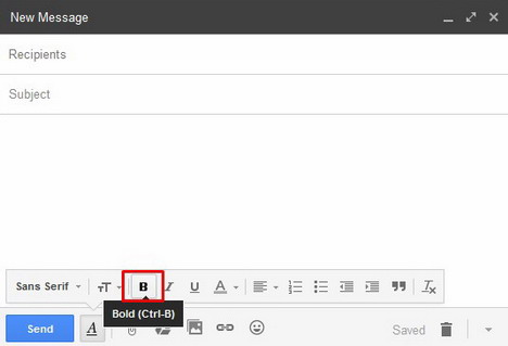
So, to eliminate the problems of flat design while maintaining its better qualities, designers came up with almost-flat. Here, some elements are given depth and dimension to balance out the flatness of the other elements. Gmail best demonstrates the beauty of almost-flat design, as shown below.
Quirky Illustrations
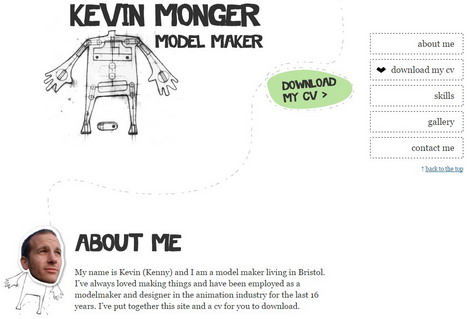
Few design elements add personality to your site better than hand-drawn illustrations. They give this quirky, yet friendly edge to your brand, and can’t be easily replicated by competitors. Whether you’re a creative, a business that wants to appeal to creatives or simply a brand that wouldn’t touch the words boring and ordinary with a 10-foot pole, this is a must-add to your site.
Of course, you don’t need to create the illustrations on your own. Freelance artists are a dime a dozen on sites like DeviantArt and Tumblr, so it’s only a matter of browsing through their work, and hiring them based on how well their art style meshes with your brand.
3. Better Use of Typography
Typography isn’t just the art of designing letters. Done right, it can breathe life into your text content, enhance the rest of your site’s design elements and help your brand stand out. Done badly, it can become a huge flaw in an otherwise flawless site.
It’s possible to download free fonts from around the Web. However, a professional designer’s customized typography is better for emphasizing your brand’s uniqueness. Also, a basic knowledge of how to make typography work helps you stay on the same page as your designer.
4. High-Quality Static Images
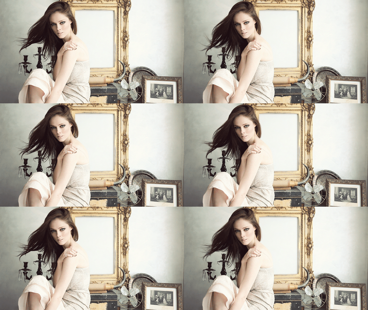
Think your website’s too plain? Try adding an image or two to the background. It can be a single, eye-catching photo spanning the entire page, or a series of photos that tell your brand’s story.
For example, in the screen-shot below, all the images have this relaxing, therapeutic feel around them – which is appropriate, given the theme of the site. Also, the superimposed text complements the images quite nicely, and provides a clear call-to-action for the visitor.
5. High-Quality Moving Images
If you’re undecided on whether to use a photo or a video for your site, consider using a cinema-graph instead. A cinema-graph, or moving image, expresses more words than a still photo, but uses up less bandwidth than a video. It can also liven up your site’s background, break up excessively long blog posts, and keep a curious visitor entertained for up to 15 percent longer than usual.
You can create cinema-graphs on your own, with the help of software like Photoshop. You can also hire a professional to help you all the way, from the creation of the video clip, down to the uploading of the cinema-graph to your site.
6. Interactive Storytelling
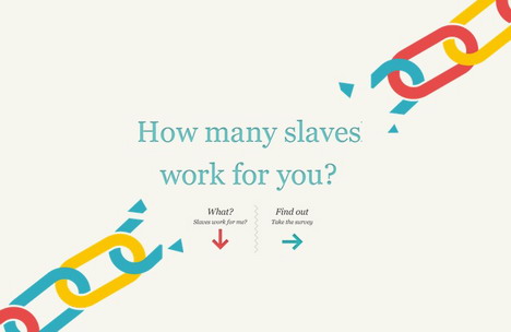
When you present an intriguing question for a site visitor, such as “How many slaves work for you,” you flip the curiosity switch in that visitor’s brain. He or she will then click one arrow or the other: “What? Slaves work for me?” or “Find out: Take the survey,” then another, and another. By the time the visitor is done, you’ll have ended your story, and converted a new fan/paying customer.
How is this possible? Well, for one, humans love stories. We love to hear about – and imagine ourselves as – characters who get thrown into conflict, and somehow find a way to resolve that conflict. We love to ask the question “What happens next?” and once we get a specific answer to that, we ask it again. Once the story ends, we’re left feeling either satisfied, or wanting more. Your job, as a marketer, is to make them want more.
7. Minimalist, User-Oriented Design
When it comes to web design, less is often more. Even the most tech-savvy, financially privileged visitor can appreciate a site that isn’t overloaded with graphics, or doesn’t use up too much bandwidth.
Not that your site has to be boring, though. You just have to strip it down to the essentials and work your design from there. If you have to add extras like sidebars and sub menus, you can hide them, and let your visitors discover these for themselves.
8. Iterations of Previous Trends
Of course, if certain trends worked before, they’ll probably still work today. These trends include:
- Responsive Web Design: A responsive site adjusts according to what device it’s viewed in. By now, this is pretty much considered mandatory for anyone who has a website, but it’s still worth noting in an increasingly mobile world.
- Endless Scrolling: Like RWD, this was designed for mobile users. A visitor simply has to scroll down, and down, to find what they’re looking for.
- Parallax Scrolling: In a website that uses parallax scrolling, background elements move slower than those in the foreground, giving the illusion of movement. This one really helps your site come to life – as long as it’s used well.
If you’ve used one, or more, of these design elements, evaluate whether they’ve contributed anything positive to your conversions – or, at the very least, your traffic. If the answer is yes, it won’t hurt to keep them on your site just a little bit longer.
Takeaway
You might be asking: “So, what’s the best web design trend for me to follow?” The answer is: It depends. It depends on your brand, how these elements work to convey your brand and how much you’re willing to invest in tweaking/overhauling your web design. Regardless of what’s hot and what’s not, though, the trend you choose to follow should serve your customers – and your brand – before anything else.
Guest Author: Savannah Hemmings
Savannah Hemmings is a professional writer for Quertime.com.


